Our Kitchen Renovation: A few Mock-ups in 3D and some (very amateur) Design Tips
David and I are demolishing our 29-year-old kitchen and redesigning it from scratch! I can’t believe we’ve lived in this home for almost 2 years now!?!! Business has been good this year, so we finally get to do the first big adult project that’s been on our wish list since day one of owning this home - redoing the entire kitchen from scratch!
After mulling over the prospect of ordering everything, contacting contractors (which deserves an entire other blog post since we live in this pandemic-induced labor shortage world now), calling HomeDepot Design Service to no avail, and playing with pieces of cut-out papers ourselves, I bit the bullet last weekend to search for a “3D design” app on my iPad and boy am I glad I did! Been playing with it for north of 24 hours now lol.
In this blog post, I’d like to go over a few before and “after” pictures and share my thoughts on why we make certain design choices for our kitchen. Keep in mind the project is still in its ideation stage and not execution yet, so things might change once during construction. If you are looking for some ideas to freshen up your kitchen, or redo your entire kitchen like we do, hope this blog helps :)
Also, Major Disclaimer: I’m not an interior designer by any stretch of the imagination. But I like to believe that I have pretty good taste and I stalk a ton of people on the design space to learn from them. I’m also pretty opinionated and make quick decisions, which means I’m not doubting myself often and that really helps us land on the “final” mockups fast. It took us 3 attempts to come up with this version.
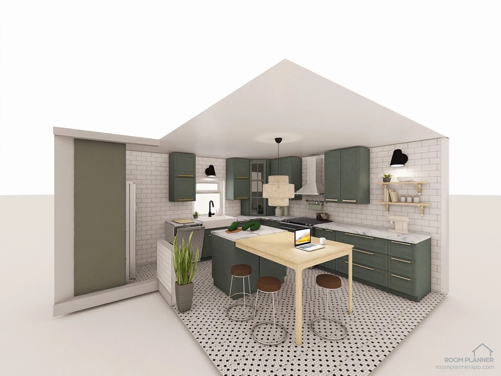
So without further ado, here they are! V3 of our Kitchen Design, in 3D, plus a few handy tips!
Step 1: Determine the Total Surface of Your Project
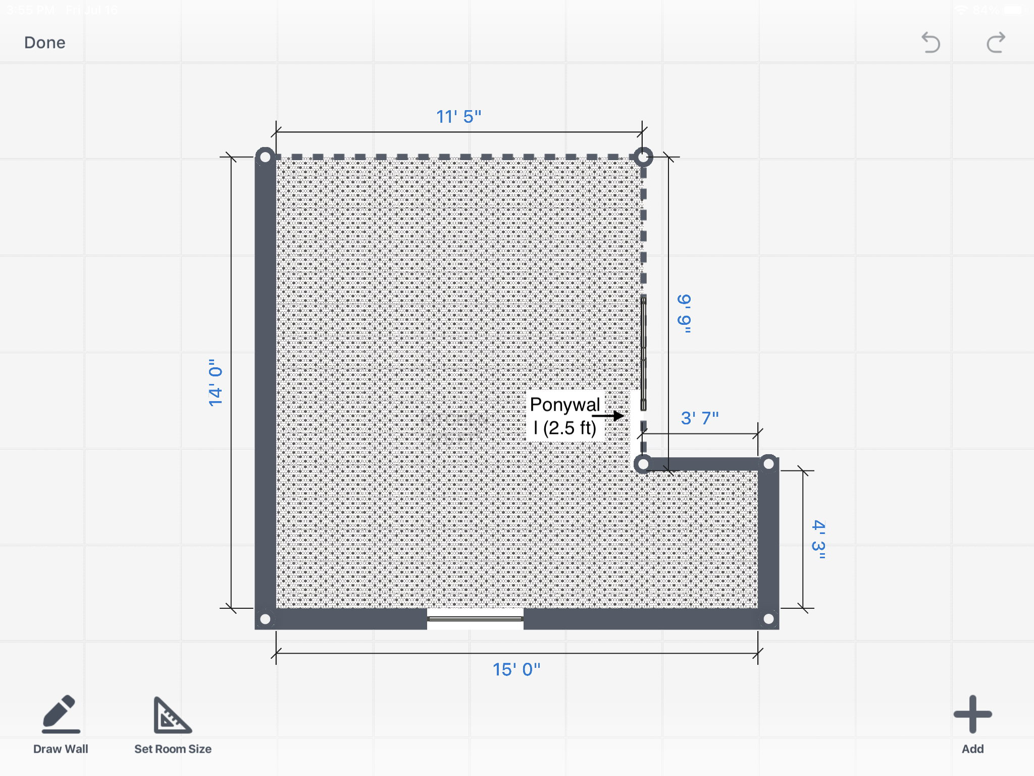
Ariel View of the Total Project
Before beginning a design project, it’s super important you know the total surface of what you are working with - what to keep, what to not! Above is the aerial view of our kitchen after certain “weird corners” have been demolished. We have our contractor take a look at the entire space and determine what can or cannot be demolished (or demo-ed, for short). At the end, it looks like most things are easy, except for the wall space right above our return air machine. So we decided to keep that wall but make it a pony wall that’s only 2.5 ft above the return air machine.
Before: You can’t really see the kitchen coming upstairs
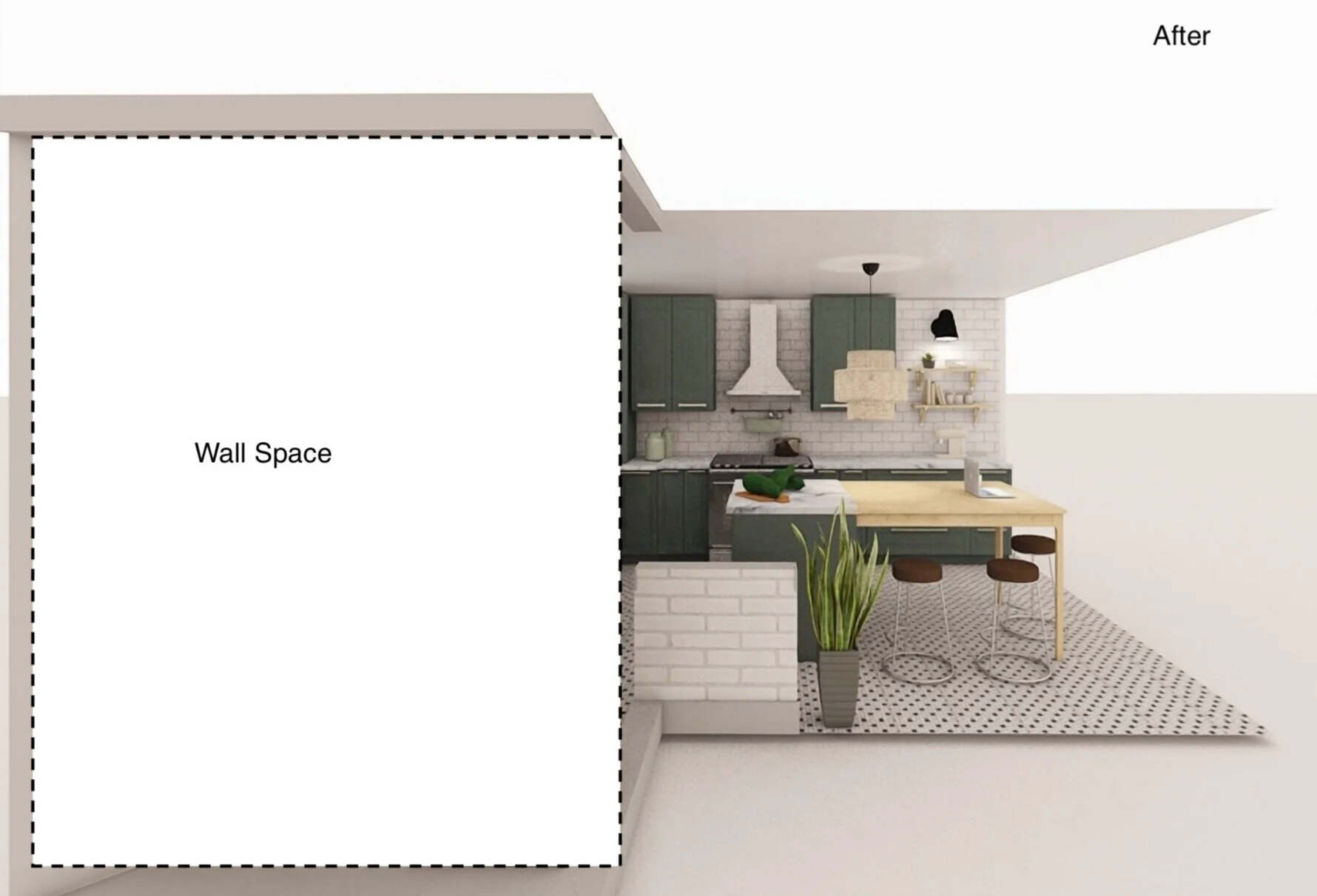
In this Before picture, you will see the “view” of the kitchen when you walk upstairs is rather…limited. We want to create an open feel, like rest of the living space. Hence we will demolish that ugly wall you see in the picture, and only keep a very small wall (the area under those dotted lines, right above the return air machine), opening up the space.
After: No more weird blocking wall!
So much better when that corner is not there anymore and the wall is shorter and stylized, isn’t it? And now you can see a sneak peek of our kitchen, open and airy :)
Step 2: Pick your Color Palette!
Before: WTF is this color palette, really?
Next, what you want to get on pretty much right away, is the kind of colors you want to go for. While our living room has a neutral palette accentuated by nature, our office a green/blue dark palette, and Norah’s room pink/pastel palette, the kitchen as is….has no distinct color palette, except for “very pale & tired”, as I would describe it.
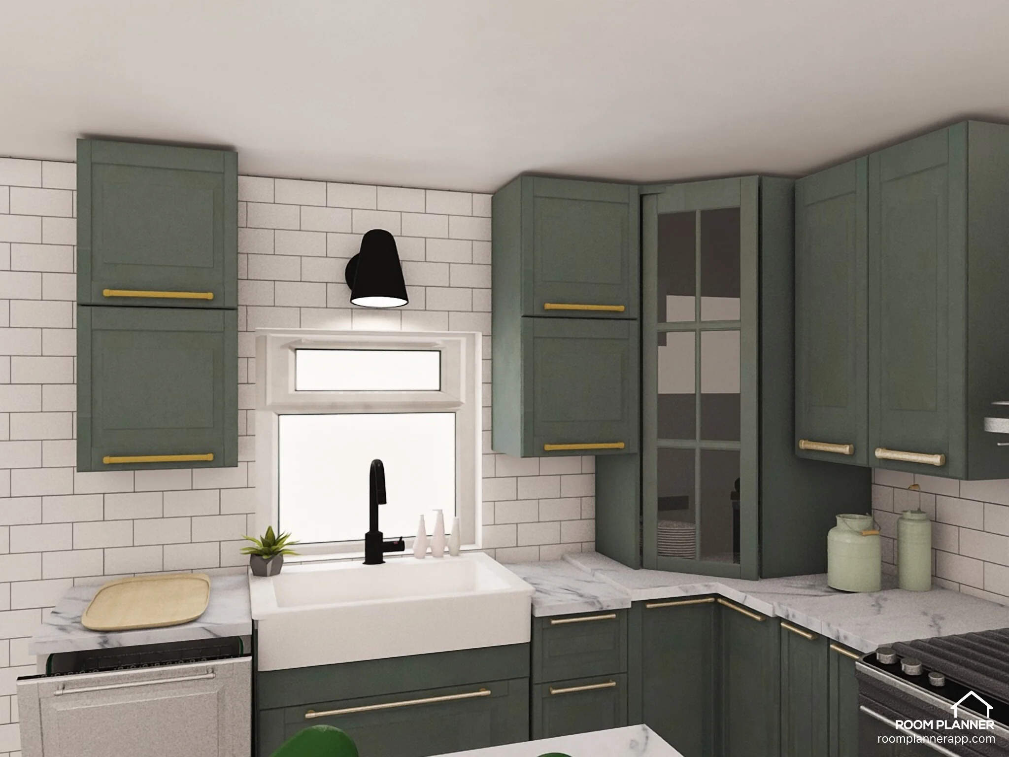
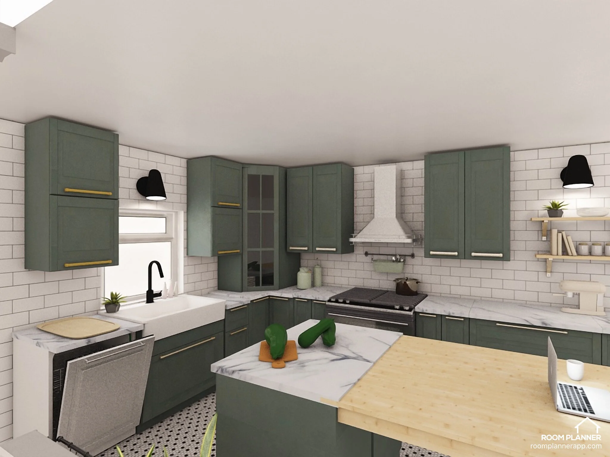
So right away, I want to switch that up! Considering how open our living room space is, I want the kitchen to contrast that and have a darker palette. In the end, I went with Pewter Green accentuated by warmer tone of butcher block & gold knobs, as below seen below.
After: Pewter Green accented by warmer tones of wood
The Butcher Block and the open shelving unit are meant to warm up the “cooler” tone of the cabinets. That couples with neutral floor and wall space, makes a pretty good palette IMO.
A dreamy, modern combo :)
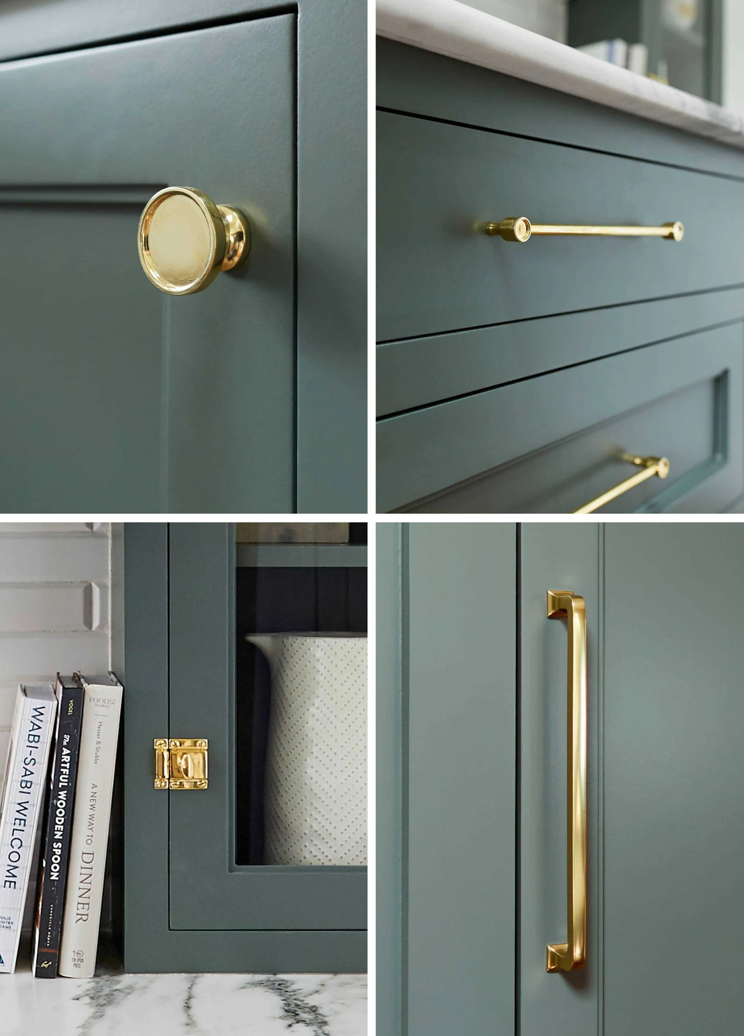
It’s hard to see with the app (which makes super realistic pictures but can’t quite recreate the actual cabinet color I want to go for), but here’s the color combo I want to go for, in an actual real life project (thanks Emily Henderson!) The green is Pewter Green by Sherwin Williams, and knobs and handles are from Rejuvenation I believe.
Step 3: Decide on a focal point
Before: Peninsula makes it hard to reach ‘em cornered cabinets
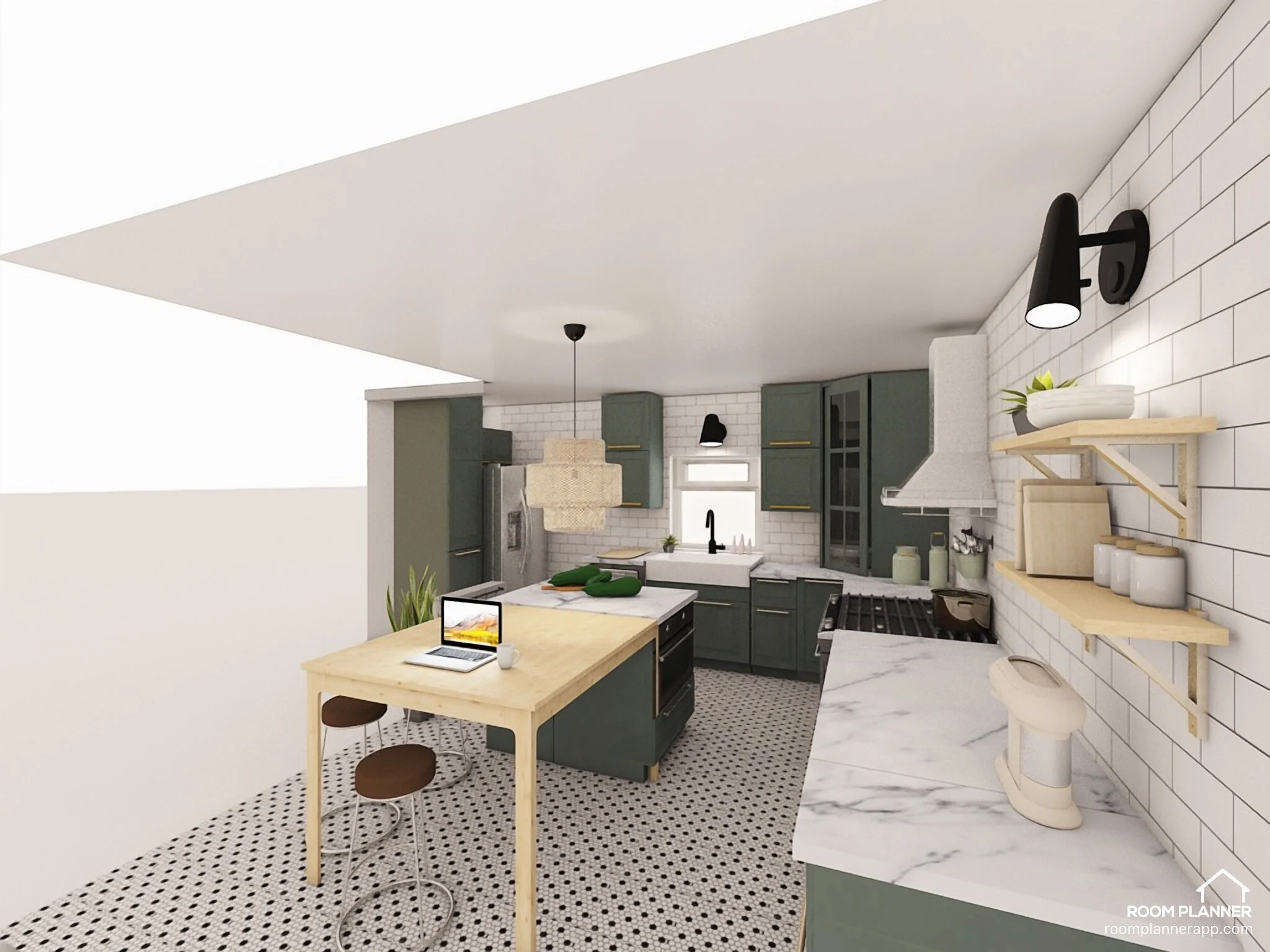
Next, you want to decide what is this you want to draw people’s eyes to. So quickly, we decided that instead of the peninsula (an “island” that is attached to rest of your counter space), we want a floating island in the middle of the kitchen that will be the “star” so to speak of our kitchen.
Plus, with this peninsula design, I (standing at a whopping 5 ft!) literally can never reach for that far right cabinet, so now i can. Win win!
After: Floating Island instead of Peninsula!
Since it’s the focal design, we want to make sure it’s unique. The island will be part island (with cabinet space and such), part table. The island portion will have a marble countertop, whereas the “table” portion being butcher block. The idea is we will do food prep in the marble portion (which can withstand heat), whereas the butcher block portion will be mostly used for hanging out and even dining.
Also, right under the cutting board you see in the picture, there’s our trash and recycling! Yay for convenience!
Step 4: Design for your space, not against it
Before: Sink right below window
In this Before picture, you see that our sink is right under our PVC window, which makes sense since it’s…entertaining I guess, to look out the window? To its left, there’s also our dishwasher (which has ceased working for over a year now lol).
We went back and forth between whether or not to keep this window (since it’s overlooking our neighbor’s house, which is not ideal). But in the end, we decided to keep the window, as well as the sink and dishwasher where they are, since we don’t want to make life harder for ourselves. Changing a major part of your kitchen like sink or stove would require you to create new water and/or gas line.
After: yay for farmhouse sink!
As seen in the picture above, we keep the “hard” stuff essentially where they are already. Instead of a stainless steel 2-sink situation, we opt for a farmhouse sink (more space FTW); and instead of a white non-functioning dishwasher, we will have a slightly bigger stainless steel one. So essentially this is a “cosmetic” change and not a “backend” change.
Step 5: Pay attention to them cabinets!
Before: Cabinets are functional but not super functional
So my beef with our current cabinets as are (beside the color and the design) is that they are not perfectly catering to our needs. For example, most of our pots and pans have to go in that corner base cabinet, but we barely (if ever) reach that super deep corner. So most of our bigger pots and pans are “out of sight, out of mind” for us. So we know we have to determine each and every cabinet function before doing the new kitchen!
After: A combo of glass, narrow, open, and big cabinets.
Everybody will tell you this when you start a kitchen reno project, but I don’t see the harm in hammering the point home one more time: When you design a kitchen, the hardest thing to get right is the cabinets (because they depend on everything else), but they are also the first thing that you have to order because they take the longest to make!
No doubt, I’ve designed and redesigned both the wall and the base cabinets at least like 5 times during the last 7 days. The version you see above is (somewhat) final and I’m quite happy with the diversity of cabinets, not just because of the look but also the functionalities as well:
For showcase, we have Glass Cabinets and Open Shelves
For big pots & containers, we have the Base cabinets with Big Drawers
For Spice, Oil, Cutting Board and other small items, we have narrow but deep cabinets
Also, all the cabinets go all the way up the ceiling now so there’s even more space!
Step 6: Varying the texture makes all the difference!
Before: All the texture looks the same!
You can’t see in this picture but our floor is basically the same “smooth” or textureless material as the countertop, the wall, and basically everything else. Well we gotta change that!
After: the floor and the wall have different textures from everything else!
At the risk of sounding like a broken record, I can’t reiterate enough how important texture, not just color, is to any design space. So we decided to go with Mosaic Hexagonal Tiles for our floor (or David calls it, French, since I often mention how important French architecture is to my growing up as a Vietnamese #colonialism lol), Subway Stagger Tiles for our backsplash, on top of the wood from the butcher block and the shelves, and marble for the countertop. All varying of textures and colors is meant to provide interest to the eyes.
Step 7: Make use of “hidden” corners!
Before: Underutilized Hidden Corner!
So what you see behind that arch is literally one vacuum cleaner and our trash + recycling, that’s it! The entire area is 15.3 square feet big but we hardly ever use the space. All the while, see that big fridge right next to our “weird” corner? Yeah those have to go.
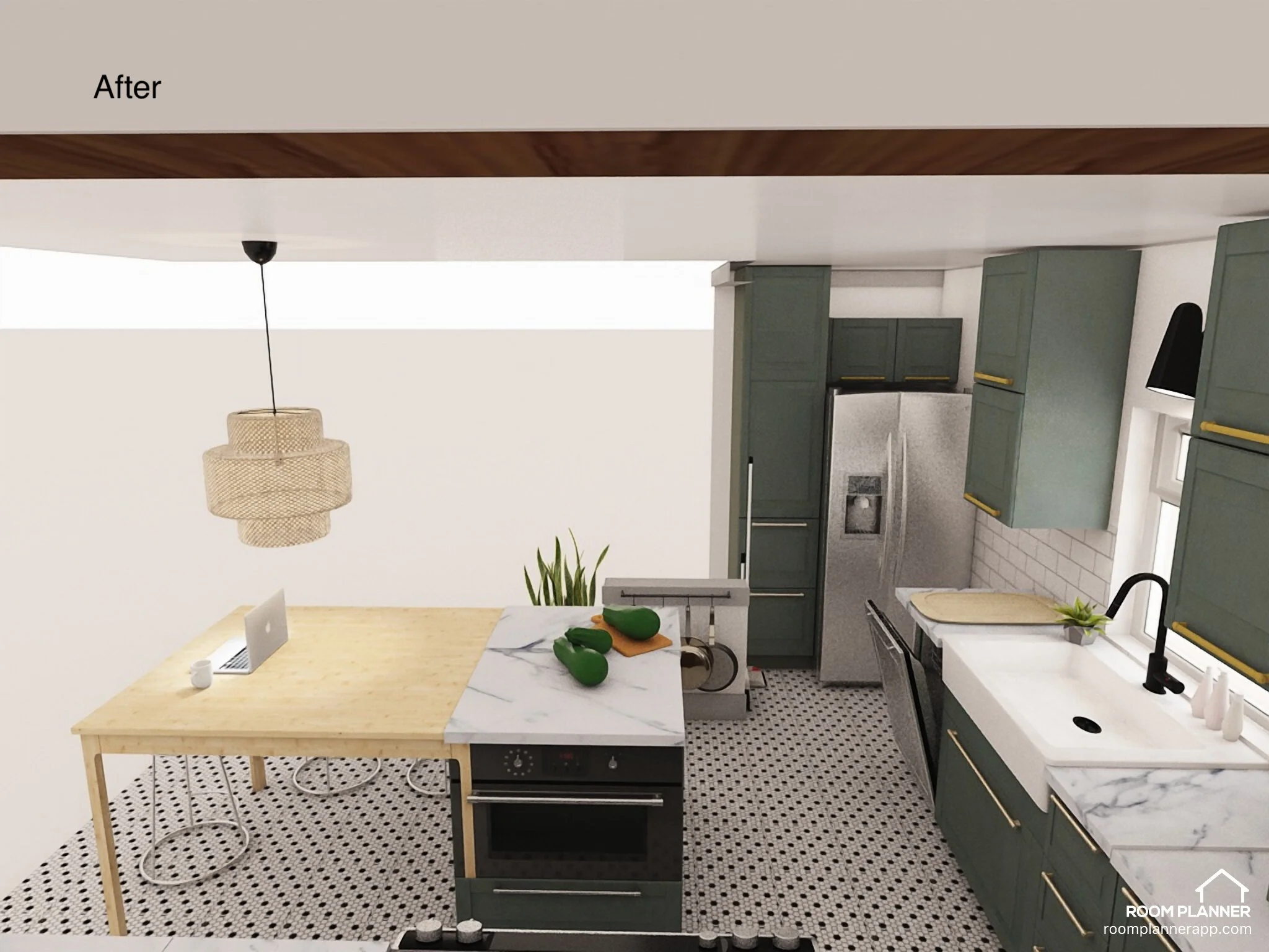
After: Fridge and pantry tucked in the corner now!
Ah, much better. That “weird” corner to the left of the fridge is now gone, replaced by only a tiny pony wall. Then the hidden corner is now very well used by having a fridge and a tall pantry so I can store things like broom and vacuum cleaner! Win win!
Also - unrelated but peep the space under the island - it’s now a microwave cabinet so the space above our oven could have the hood instead of the ugly microwave. Double yay!
Some last words
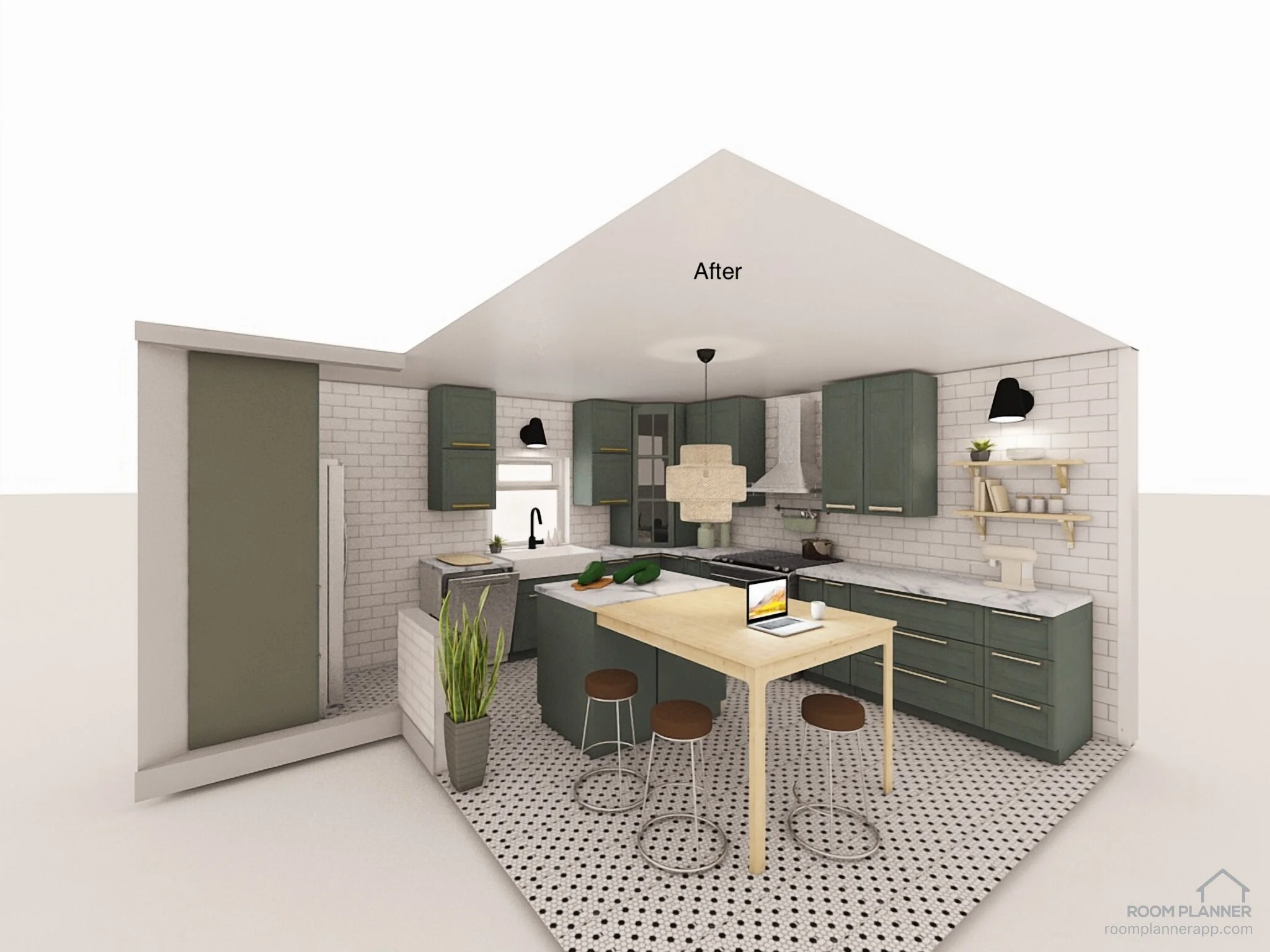
An overview of the entire space, again. No idea why the wall to the left of the space doesn’t show and looks like it’s completely open lol
Designing this kitchen has been an absolute thrill! I’m sure we will realize that we’ve made a ton of stupid mistakes once construction actually starts, but I’m glad that we come up with something that we are both happy with. Plus, even if the eventual design looks even just remotely like this, I will be a happy bird.
Until next time, be well and stay tuned for more updates to come!

